Kid Reporter Rankings: The NHL Reverse Retro Jerseys

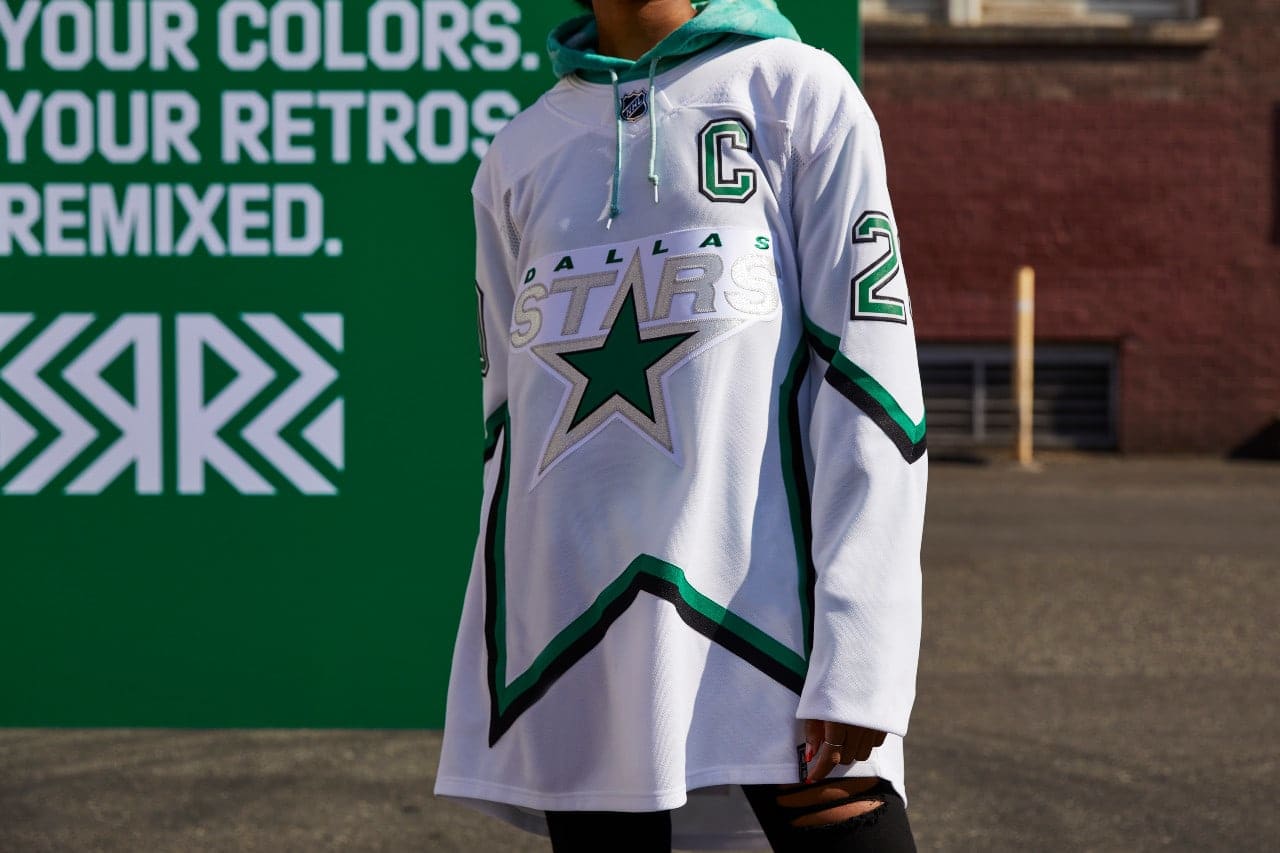
The Stars’ lackluster jersey is a lot of white and isn’t really that special.
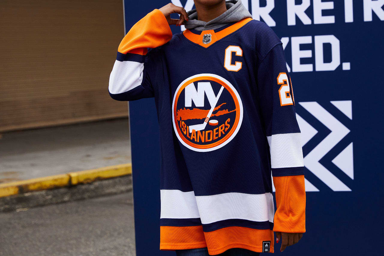
The jersey looks exactly like their home jerseys—the blue is just a darker color. I think we were all rooting for the return of the fisherman.
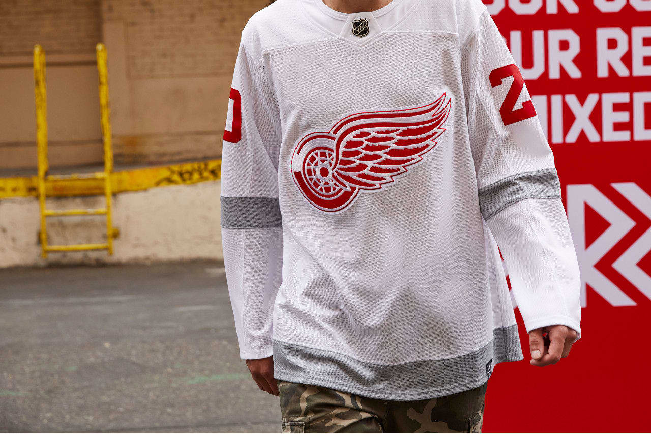
Detroit has one of the most classic jerseys in sports, but this jersey just ended up looking like a practice jersey.
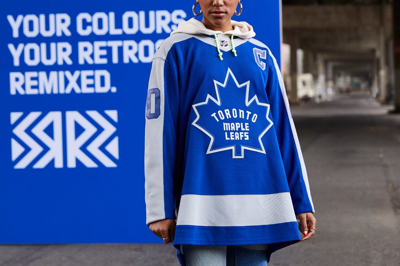
As one of the original six, Toronto had a lot of designs to work with, but their reverse retro jersey does not capitalize on that history.
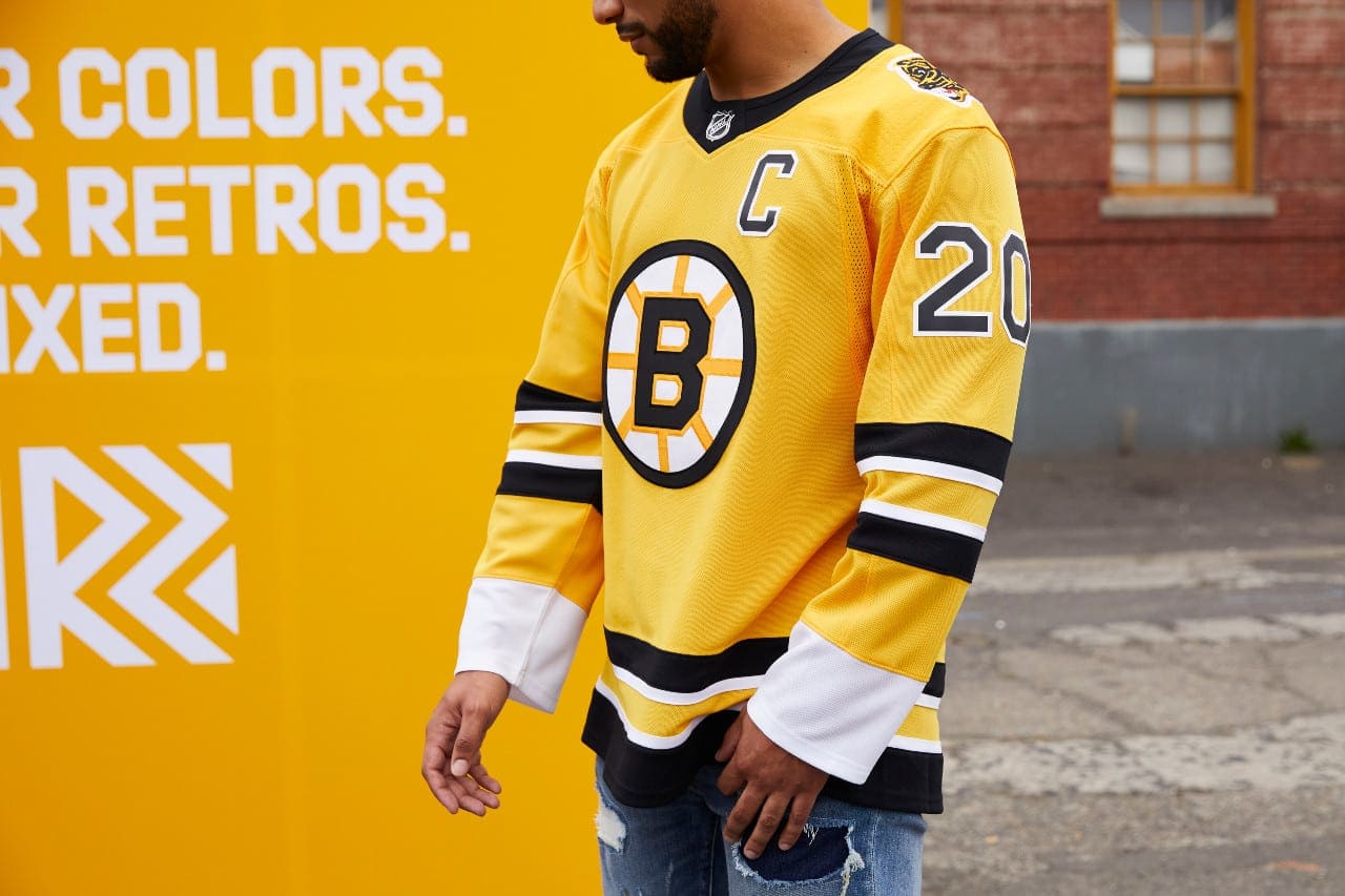
The yellow reminds me of mustard, but I think it is cool that they brought back “Pooh Bear” on the shoulder.
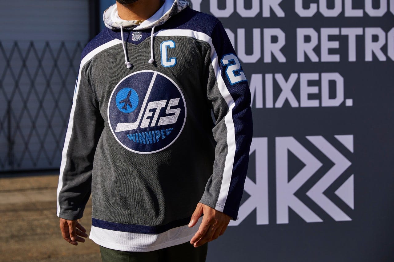
The Jets brought back one of their best logos. The problem lies with the bland colors. It could use some pop.
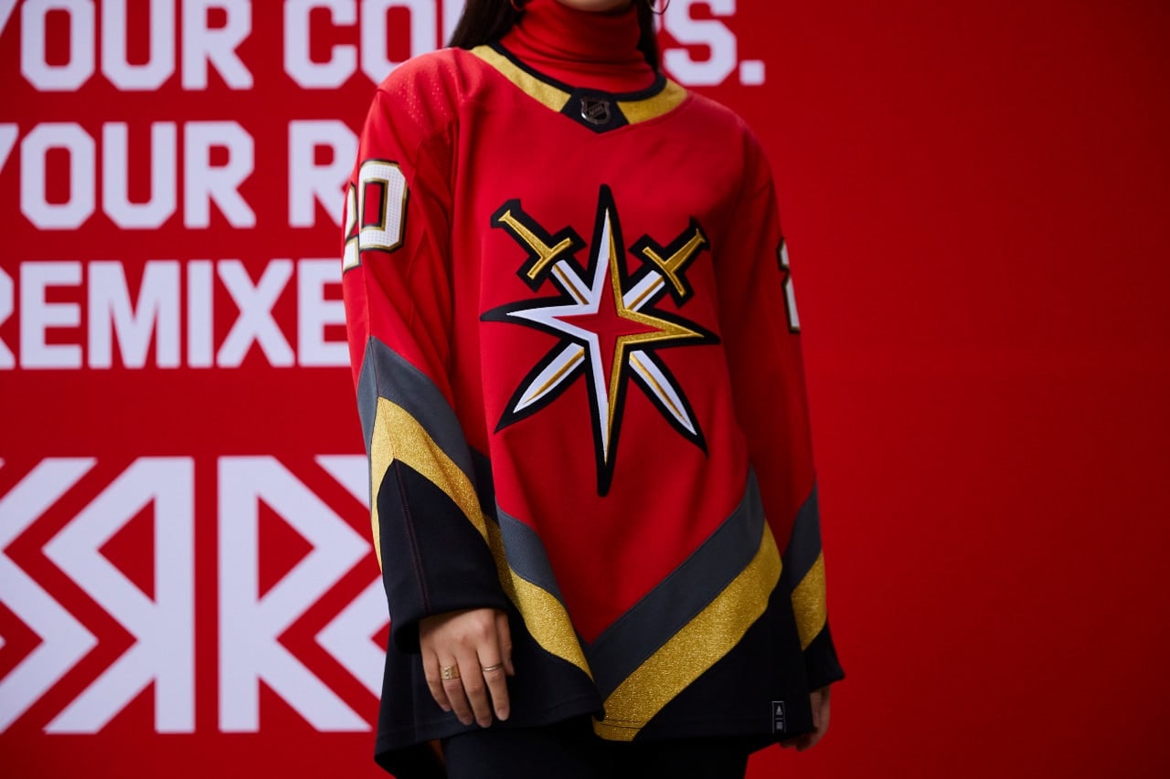
The Golden Knights did a good job with their first "retro" design. Their alternate logo goes nice with their pattern.
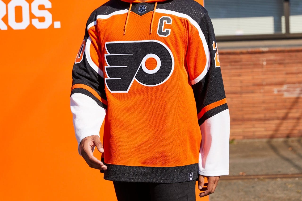
The Flyers jerseys improve upon their regular jerseys with a simple yet satisfying twist on the color scheme.
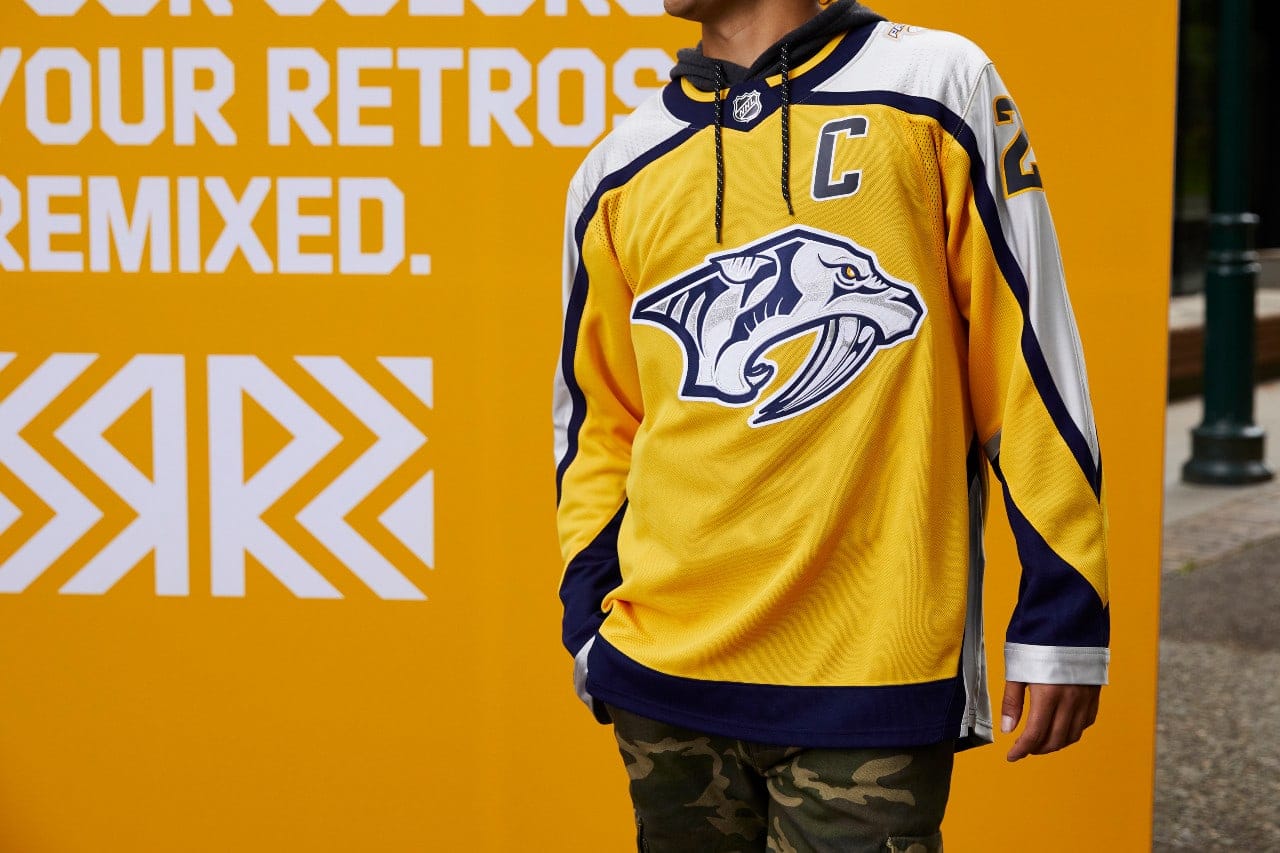
The Predators' yellow jersey is a solid design. The sabretooth side patch is a ferocious addition.
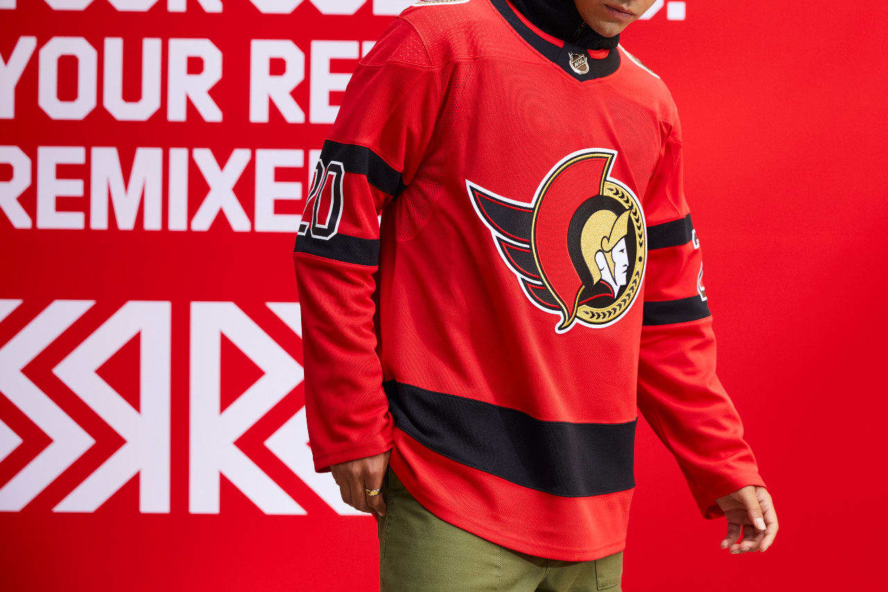
I think they are good, but it is a let-down since they already announced that they were going back to a similar two-dimensional logo full-time.
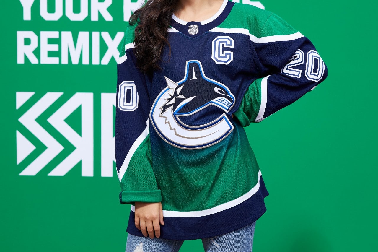
I would like to have seen a throwback to the orange and red “flying V” jersey or the “stick” jersey from the 1970s to shake things up.
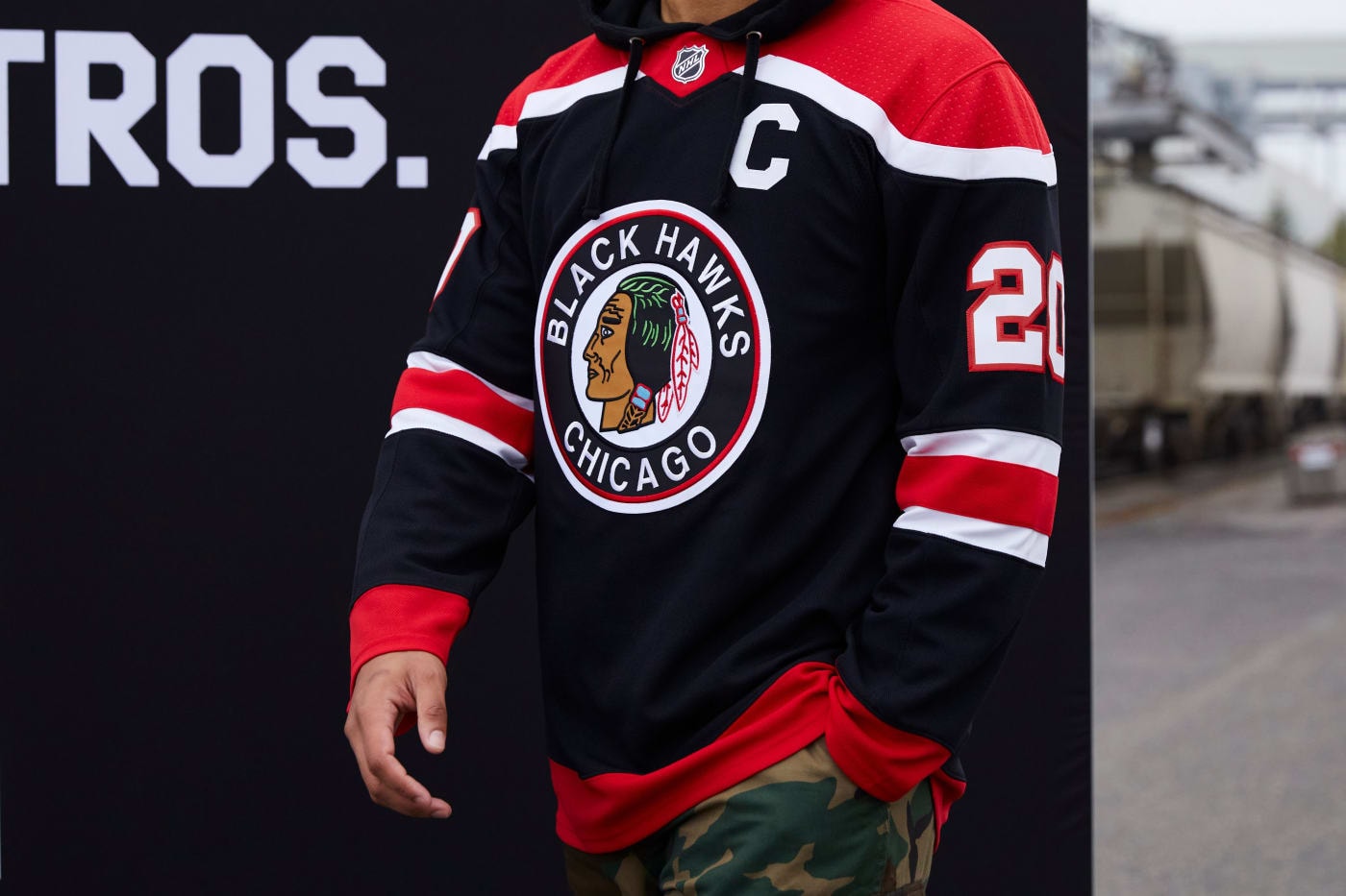
Another clean original-six color scheme. Solid.
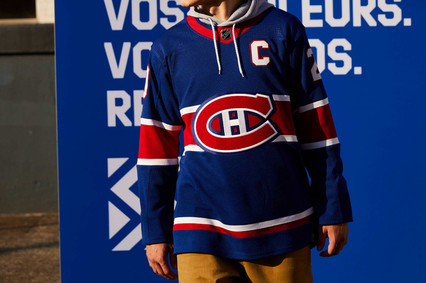
The reverse retro jersey is a modern twist on a classic with their snazzy “C-H” logo in blue.
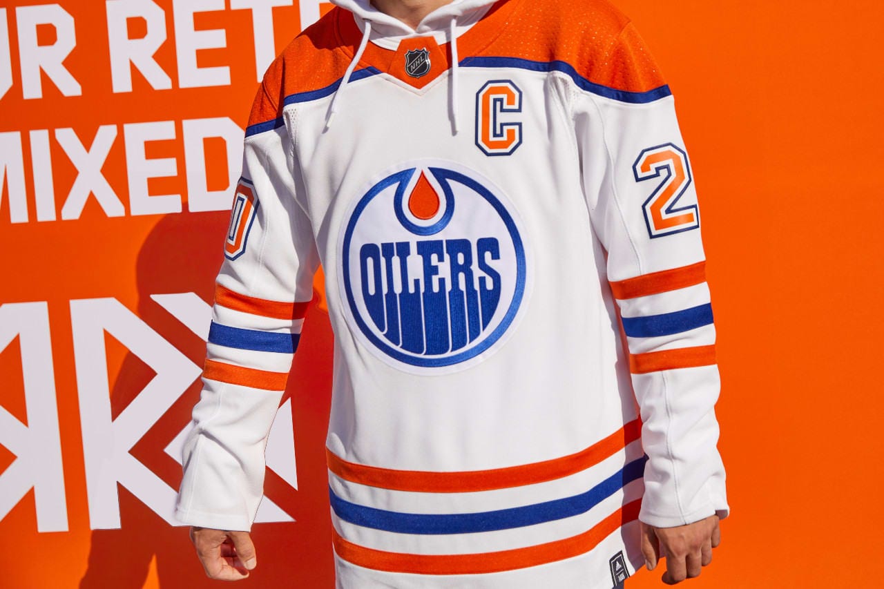
The colors work well, creating a clean, polished look.
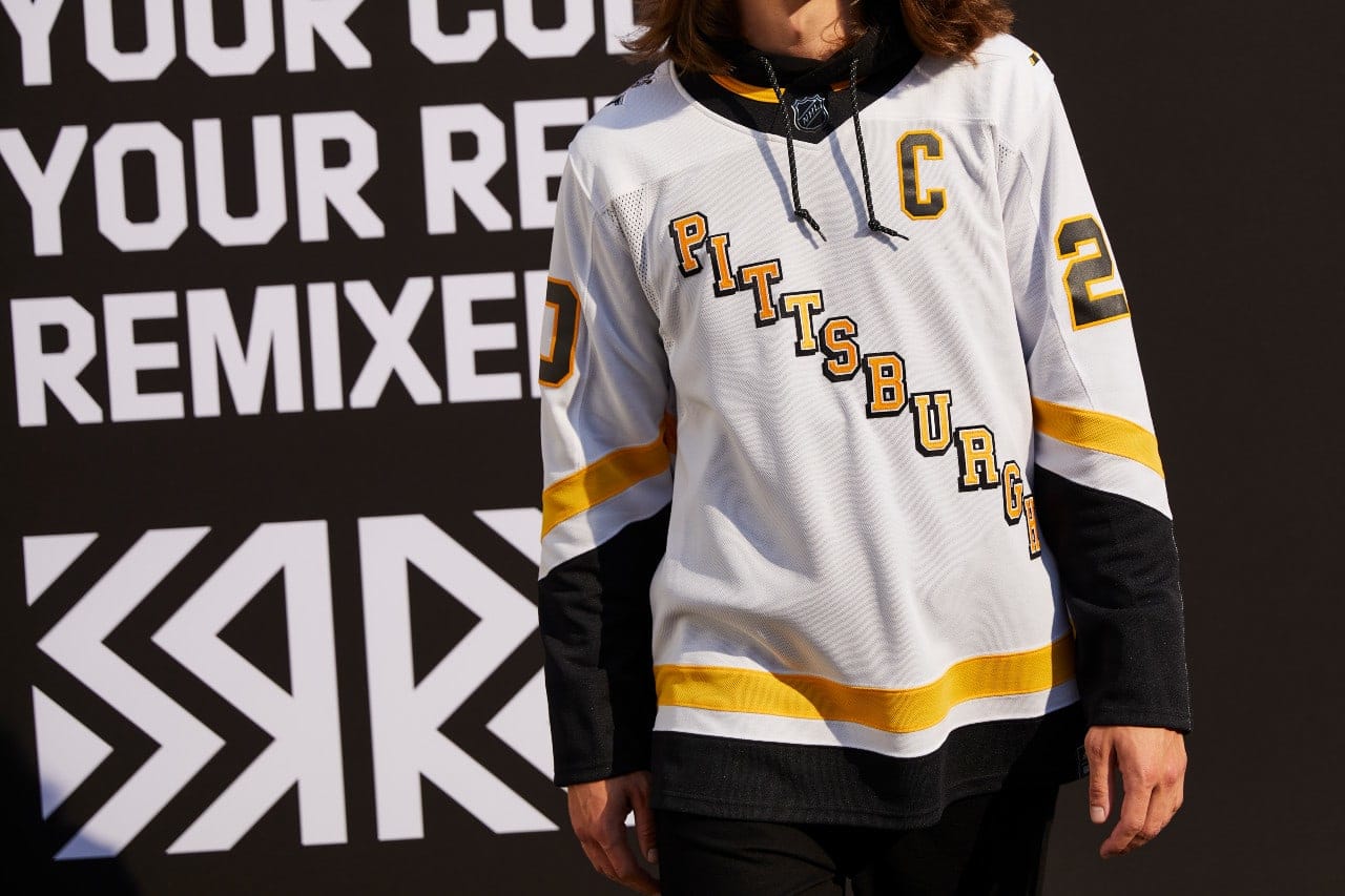
The Penguin jerseys are throwback to their original jersey and remind me of Jaromir Jagr.
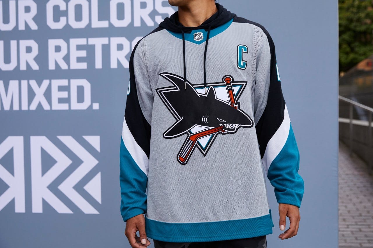
The Sharks jersey is a remixed version of their original jersey. The red hockey stick gives the jersey a kick.
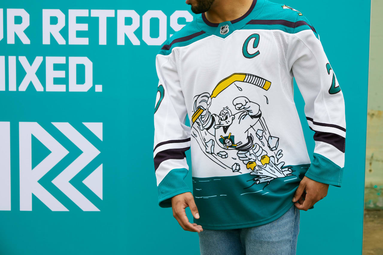
The Ducks took a chance with the Wild Wing design, back from the 90s. Kids will love the design.
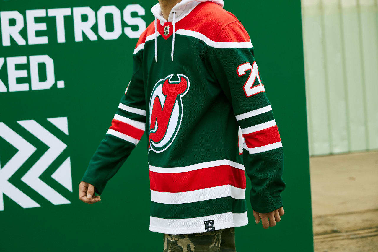
These red and green jerseys are simple and Christmasy. They are engaging, and will look great on the ice.
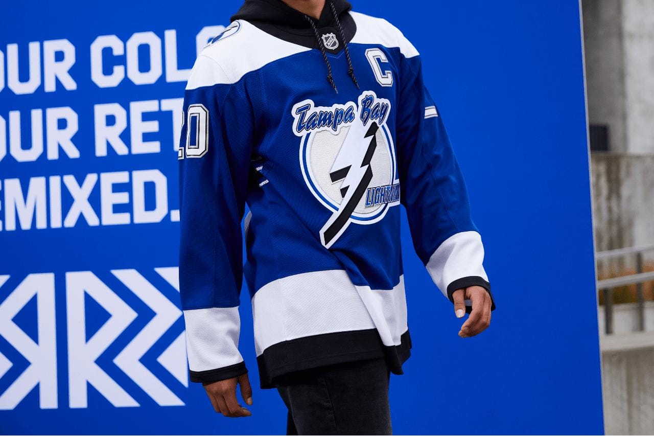
The Lightning brought back a jersey that mirrors the first time they won the Stanley Cup, in 2004, but in blue, which is very fitting.
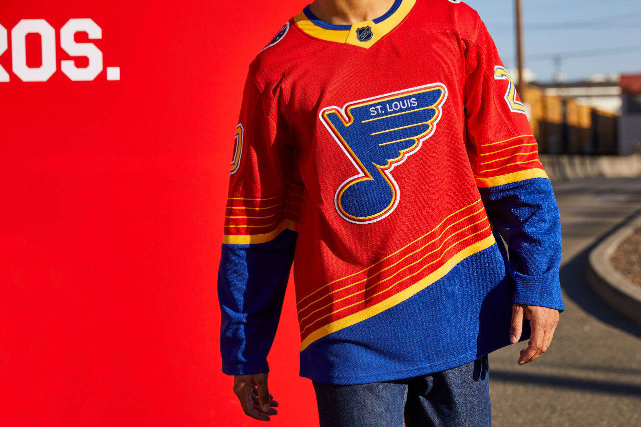
The red, blue, and yellow jersey of the Blues pop, and I can’t wait to see these on the ice.
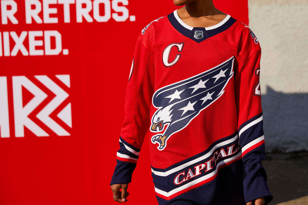
The Capitals brought back the jerseys of rookie-season Alex Ovechkin. The red, white, and blue with the eagle is both patriotic and classic, which will make it a sought-after jersey.
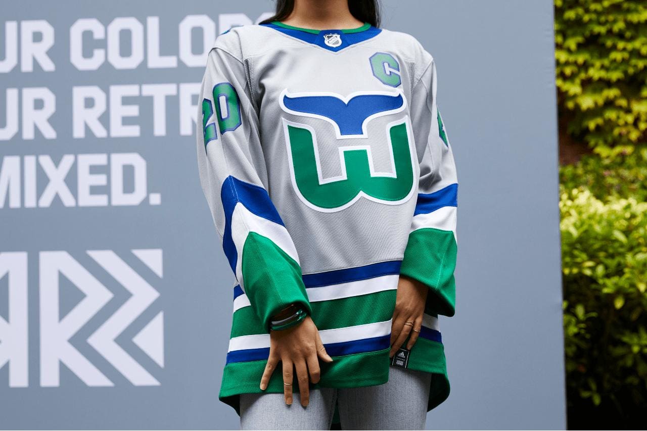
The Hurricanes jersey harks back to a time when the Hartford Whalers had the Brass Bonanza. I think it’s great!
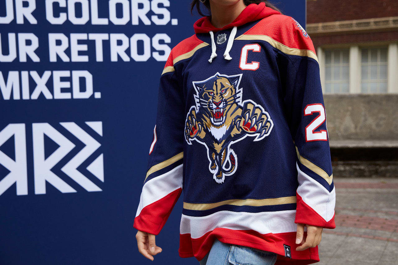
The Panthers have brought back their old panther logo, which some people think they should have never changed. With the addition of a palm tree on the shoulder to give a nod to their state, the jersey is a classic.
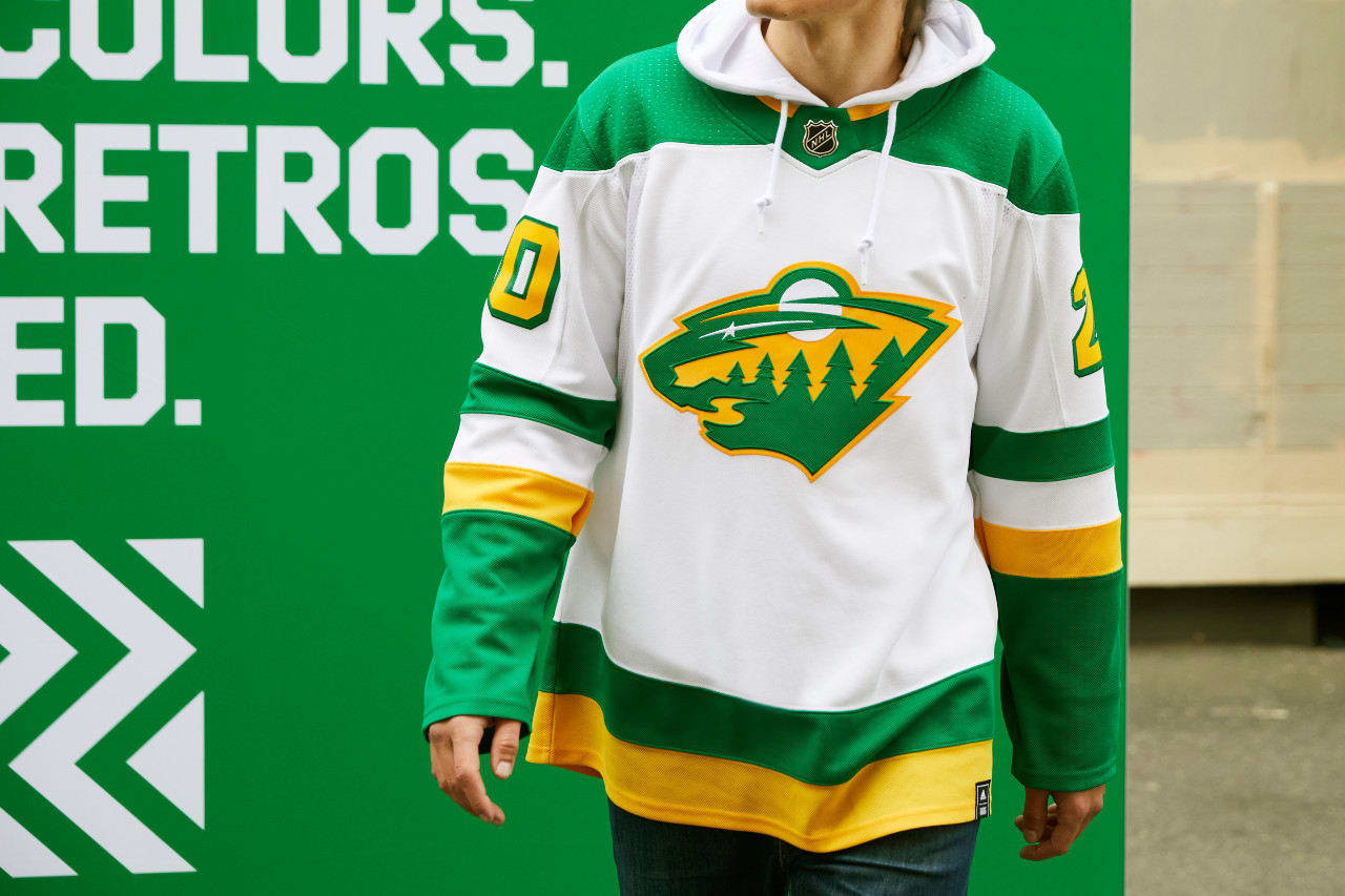
I like that they brought back the North Stars scheme, but the lemon-lime colors remind me of Subway.
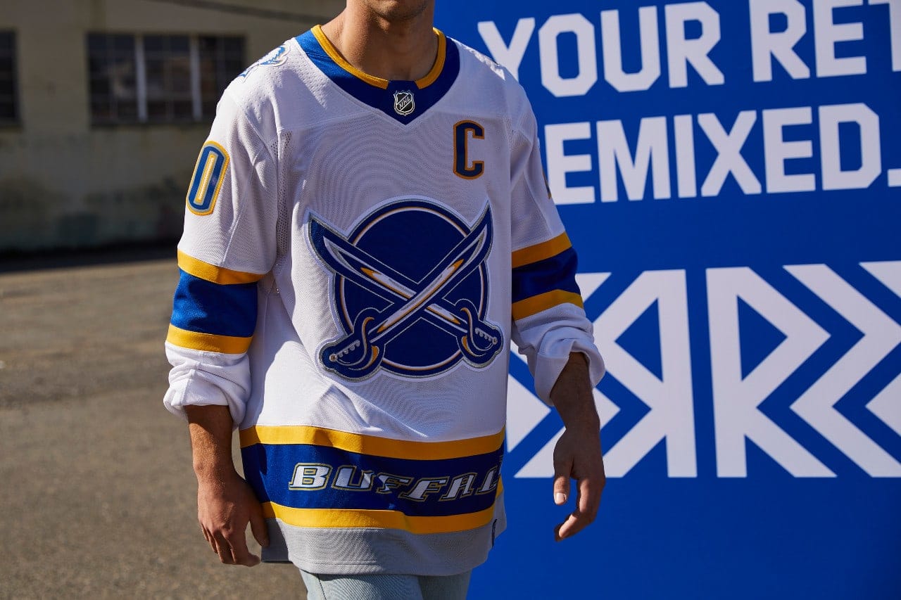
The redesigned sabre logo removes the Buffalo to evoke swashbuckling heroes. I can’t wait to see what damage they do on the ice with this new design.
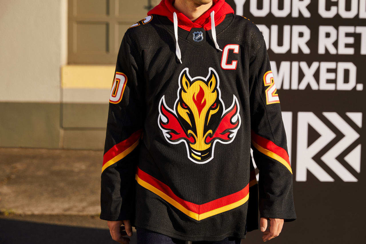
“Ol Blasty” is back! I love these Flames jerseys and Calgary will sizzle on the ice.
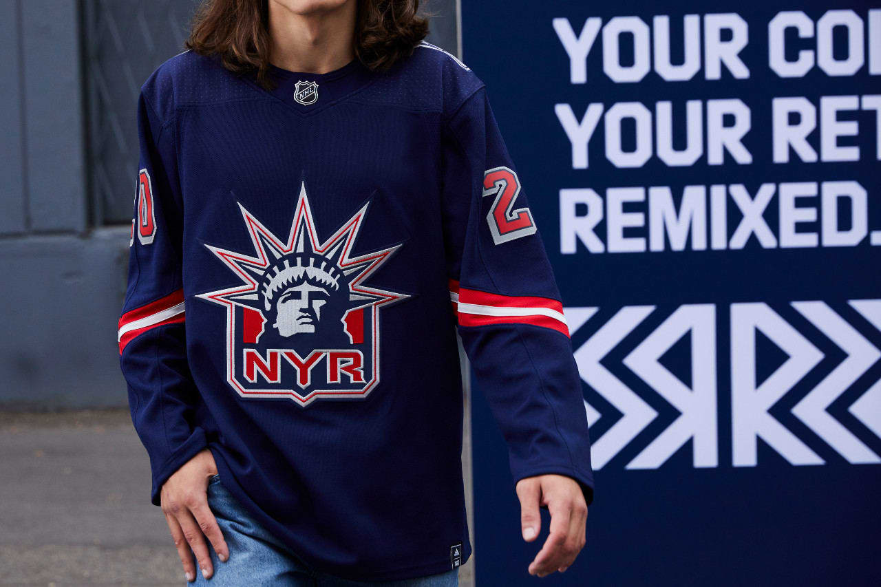
The Rangers return with Lady Liberty. Harkening back to an earlier logo, it’s a classic look befitting the Big Apple.
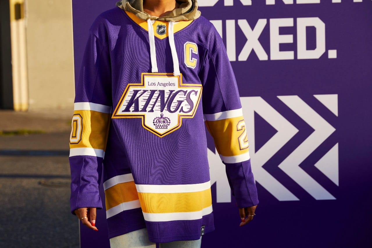
The Kings mixed the colors and logos from their great history to create these great purple and yellow jerseys. These will be flying off the shelf.
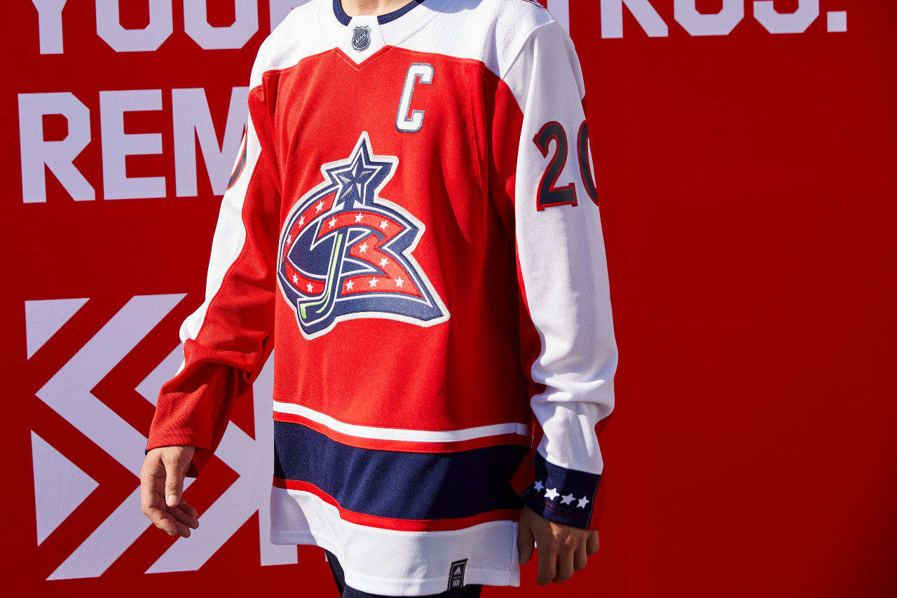
The Blue Jackets have created an appealing red jersey with their original “CBJ” logo. It represents the team well and the colors pop.
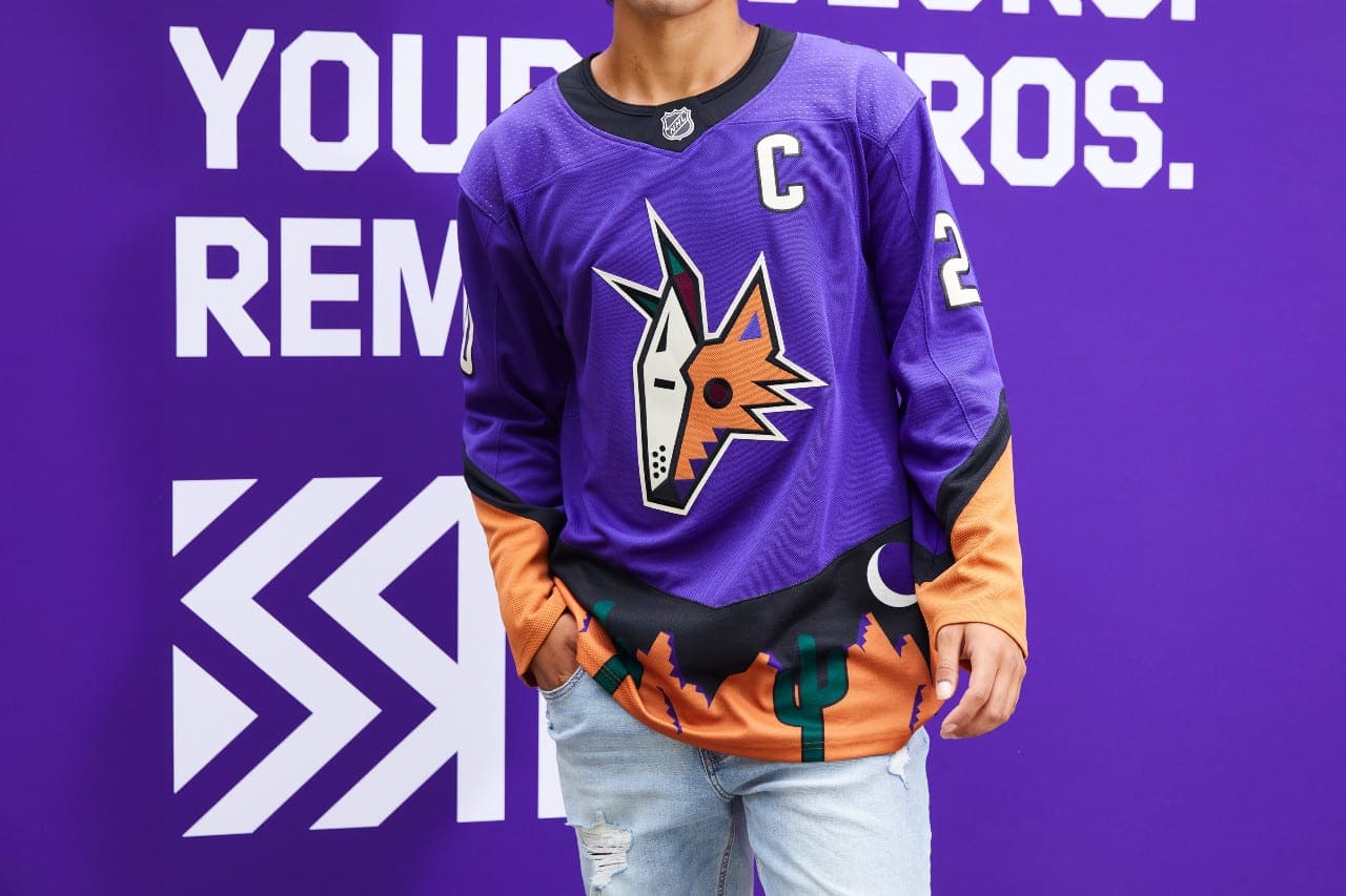
I think the Coyotes jerseys are great. They feature the Kachina coyote head, coupled with the representation of a desert with a cactus and a moon. I can’t wait to see these on the ice. These jerseys are sure to be a new fan favorite.
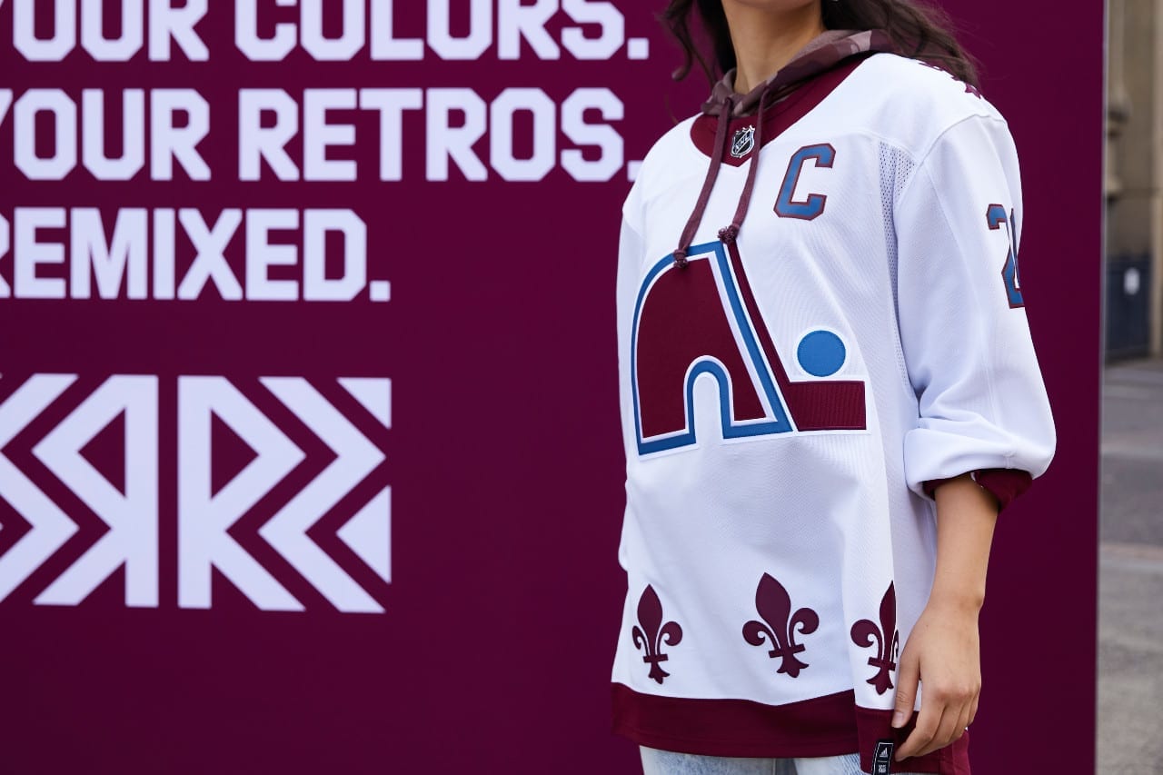
The Avalanche smashed it out of the park with this jersey earning the top stop. With a nod to the Quebec Nordiques, who moved to Denver in 1995, the jersey’s fleur-de-lis pattern combined with the Avalanche colors is a classic in the making.
