Islanders Resurrect Fisherman Crest During Pre-Game Warmups

It was Throwback Tuesday at the Nassau Coliseum yesterday — but for some New York Islanders fans it might as well have been Nightmare Night.
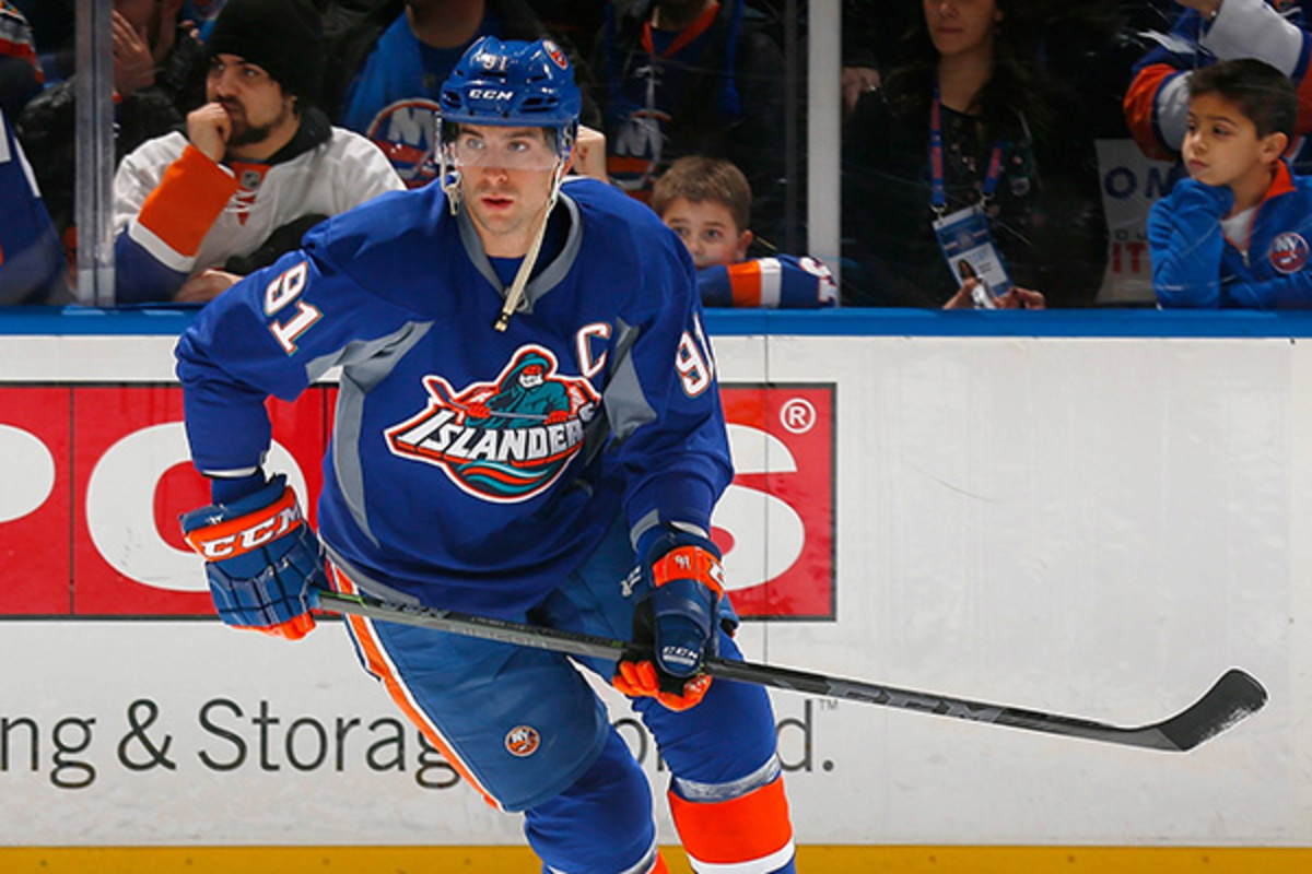
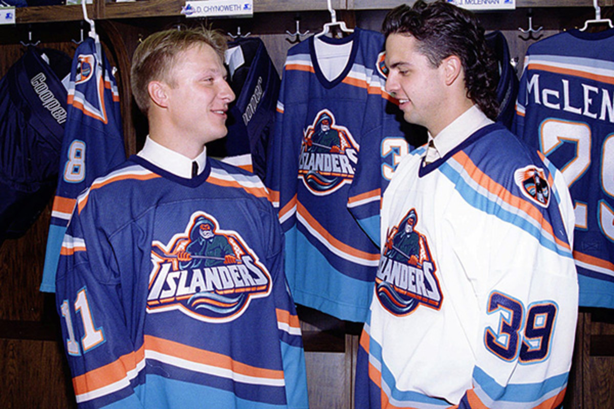
During warmups before their game with the Florida Panthers, the Islanders dusted off an old logo from the 1990s. Some fans call it the Gorton’s Fisherman, others Fishsticks. But most die-hard Isles fans consider it a disaster. The crest was used by the team from 1995-1997, some of the worst years in franchise history, and when it was retired most thought they’d never have to see it again. But last night, the team brought it out of storage to commemorate Long Island’s Coliseum, which the Isles are abandoning at the end of the season for Barclays Center in Brooklyn.
Last night’s pre game unis were auctioned off for charity, and there’s no word on the fisherman making a second appearance this season.
And that probably suits fans just fine. The Isles are having a great season (currently first in the Metropolitan Division with 65 points), and that old logo is a bad reminder of some bad days for the team. (The Islanders lost last night, 4-2, by the way. Coincidence???)
Could that photo get any more '90s?
That crest (maybe) casting its bad magic on John Tavares’ warmup sweater is one of the most divisive logos in NHL — and maybe sports — history. Depending on who you talk to, opinions range from embarrassment to outright hatred. A few people, especially kids who grew up in the ‘90s, have fond memories of it; most wish it would disappear forever.
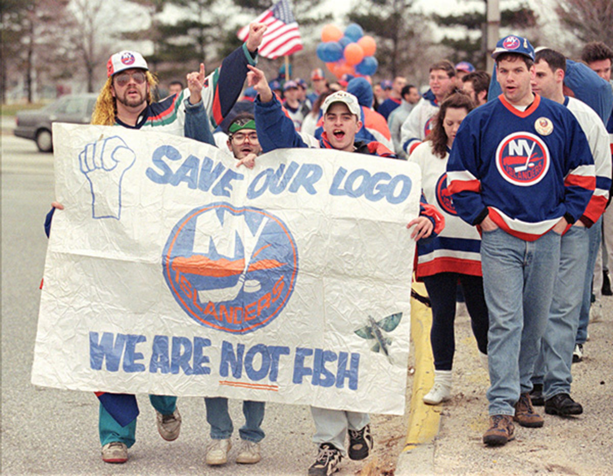
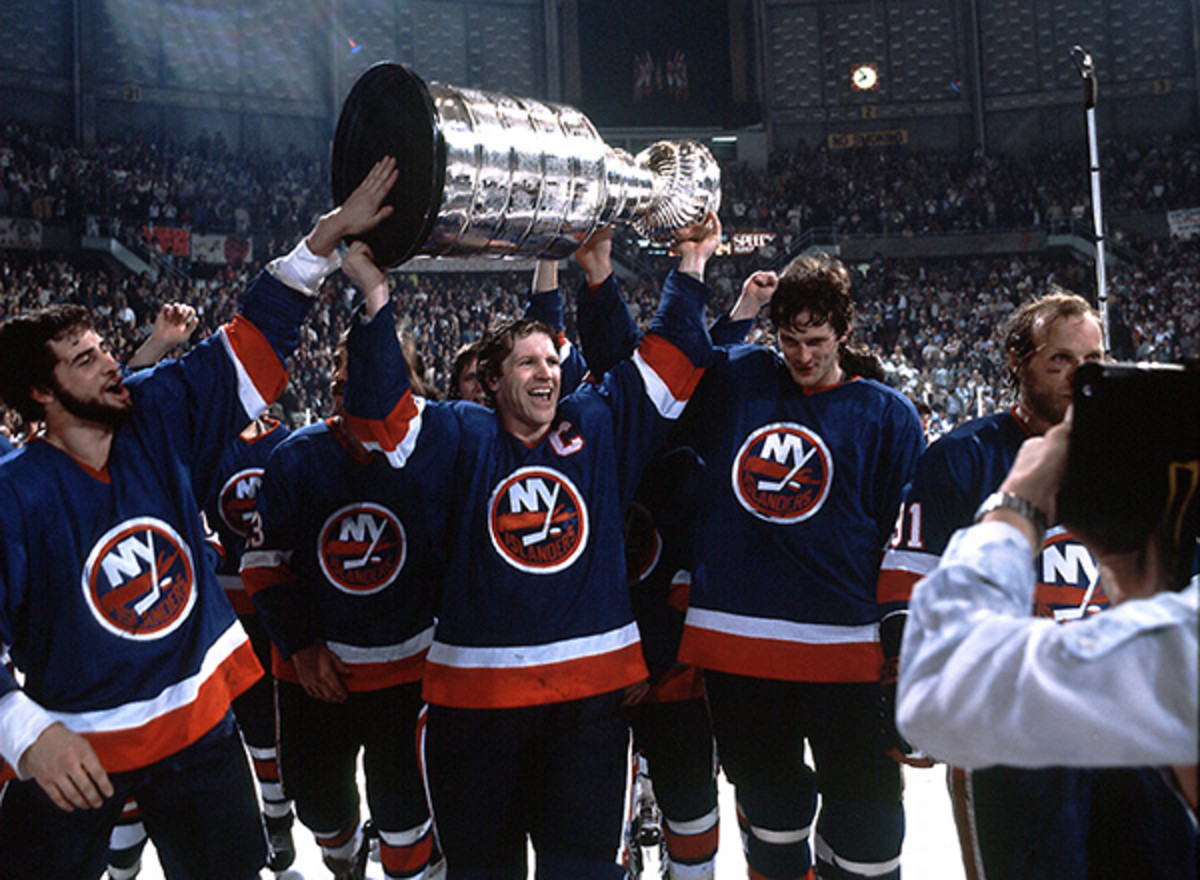
More than that, though, it represents a betrayal. The Islanders have one of the most iconic logos in sports, and they won four straight Stanley Cups wearing it. But back in the 1990’s, altering your team’s look was all the rage and the Islanders had to cash in. Except that it completely alienated their fan base — a group of people so dedicated to the team that they took to the streets to protest the new logo.
I mean, it’s hard to blame them. Look at how great the Islander’s original unis looked after the team won the Stanley Cup in 1982:
The fisherman crest is, without a doubt, one of the worst ideas any NHL team has had for a rebrand. And yet, it has a so-bad-it’s-good quality to it that’s undeniable. It was nice (I guess?) to see it back on the ice. I grew up watching hockey in the ‘90s, so hooray for nostalgia! But, yeah, it’s not good. And the Isles should probably keep these fishermen buried in the back of Davy Jones’ locker. Forever.
Shameless plug: If you like ugly jerseys, you’ll definitely want to pick up our March issue, on newsstands next month!
Photos: Mike Stobe/NHLI via Getty Images (Tavares), Jim Leary/AP Photo (Kasparitis), John Dunn/AP Photo (protest), John Iacono/Sports Illustrated (Stanley Cup)


